The HUD is basically how a live match communicates to viewers -- it’s the interface that contains all the information about a game’s status, including champions, items, abilities, buffs, kills, time, gold, and more. And starting this week, LCS and Academy viewers will get to experience LCS games in a new and improved way, with a new HUD.
Since we hadn’t shared much context on why we updated the HUD in the past, we wanted to take a deep dive into the purpose of the HUD, explain why we’re tackling HUD improvements for the next split, and show why we think it will help improve the LCS viewing experience for newcomers and long-time fans alike.
THE HUD OF SEASONS PAST
=======================
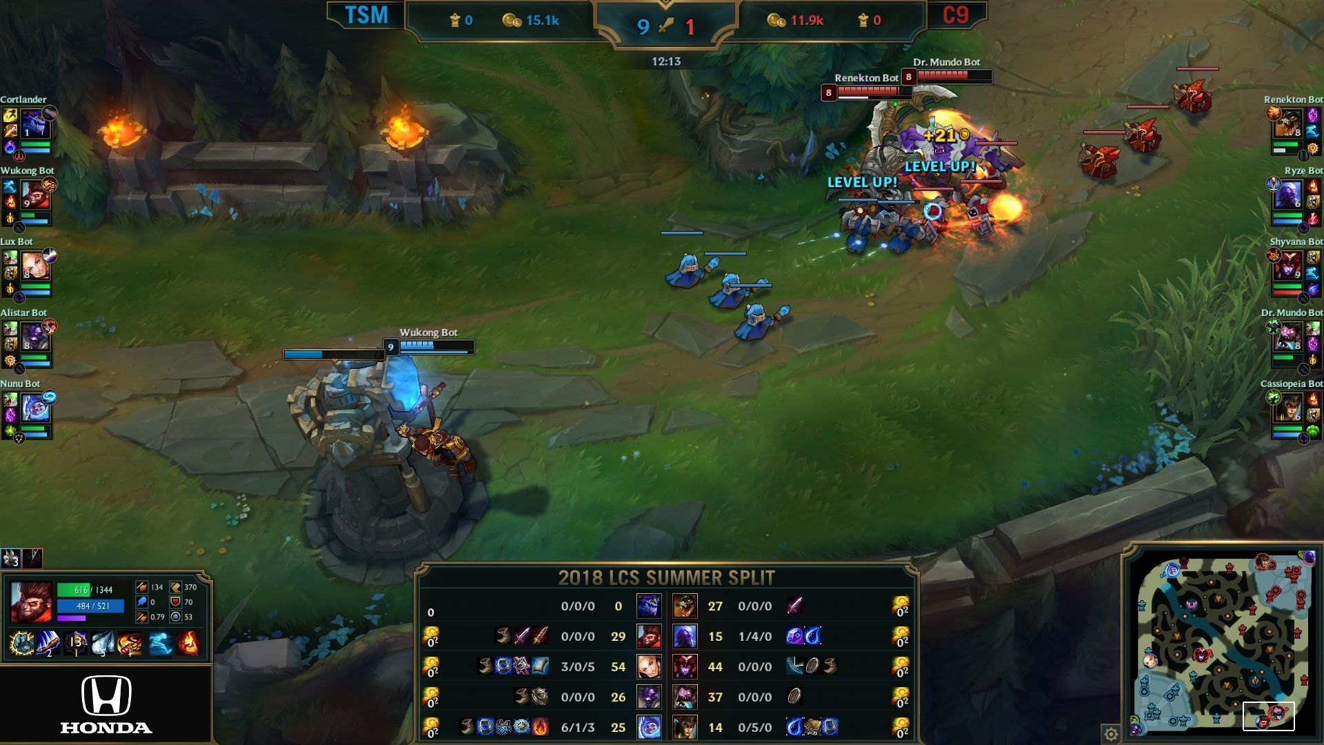
In the 2019 Season, the LCS broadcast HUD closely mirrored the visual design and experience in-game. In a game of League of Legends, the HUD is an extension of the world where the game takes place, Runterra. [This visual design is inspired by Hextech magic][1], the combination of the magical and technical commonly found in Piltover. At the time, due to some technical constraints around pulling live data, and because we wanted our game to closely mirror the live experience, we created a simplified version of the Hextech interface. In addition, we closely mirrored the viewer experience to what you’d see in-game -- so competing teams were always displayed as red side vs. blue side from the top bar down to their player cams.
While the high fantasy design meets the gameplay needs, it doesn’t necessarily meet the needs of the LCS. Similar to how the visual design of Hextech in the League of Legends client pays homage to the game itself, we wanted to explore how we could better connect the HUD to the LCS as a brand, visual style, and sport.
RECENT ADJUSTMENTS TO THE HUD
=============================
[1]: https://nexus.leagueoflegends.com/en-us/2016/12/the-visual-language-of-hextech/
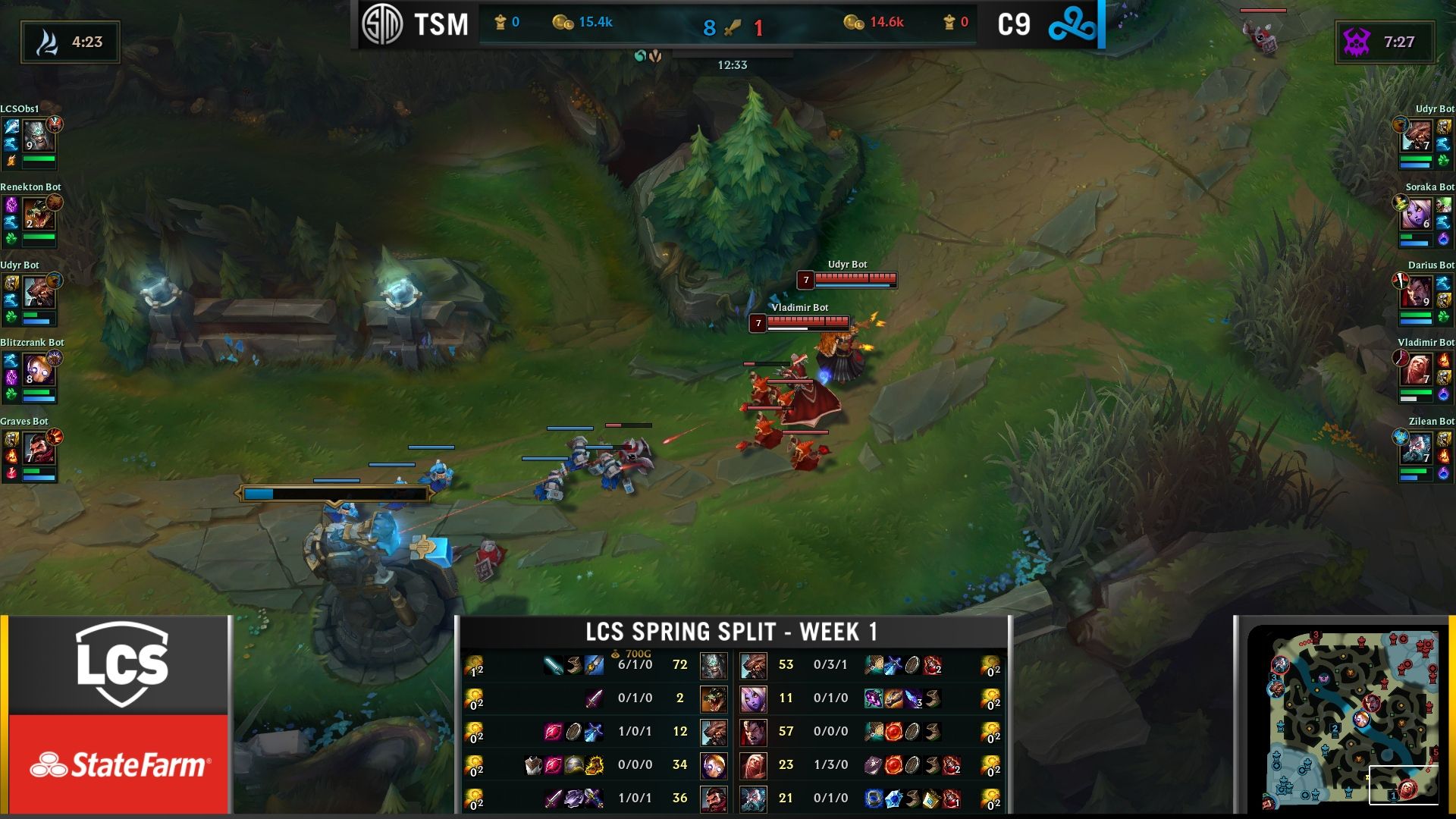
We started by implementing small improvements to the HUD this Spring Split. We moved away from the mystical elements of Runeterra to make it more of an extension of the LCS, and to make the viewer experience of the HUD similar to watching a traditional sports match. This way, the HUD makes it much easier to digest information about the status of the game while you’re watching the game live. We also wanted to make it easier for viewers to understand who was playing and allow our teams’ unique branding to be better displayed during matches.
With the departure from Hextech design, we moved away from red side and blue side branding to make team branding and colors more prominent in broadcast, as seen in the top bar and lower third. We also updated the player names to be more readable on the player cameras by making them white, rather than their red/blue side color.
After gathering feedback from the community, however, we found the HUD didn’t meet all the needs for fans, who wanted the interface to make it easier to track information during LCS and Academy matches. While the improvements brought us closer to our goal of moving to a sports match-style HUD, versus a high fantasy design, we knew we could create a more consistent visual style that better represented the LCS.
UPCOMING IMPROVEMENTS TO THE HUD
================================
Recognizing our Spring Split improvements to the HUD weren’t enough, Dave/RumbleStew, Executive Producer of the LCS, asked Charles, Creative Lead, and Justin/Riot Oniatserj, Creative Technology Producer, to lead a strike team made of broadcast producers, graphics producers, and creative designers to tackle a new HUD for the Summer Split.
After combing through fan, team, and internal feedback, the strike team identified two major areas to address in the next HUD update:
- Improve overall readability and digestion of information for all
stages of a game -- and, simply make the HUD look nicer
- Implement a streamlined visual style that the LCS could own as a
modern sport
While most of the game information in the HUD remains in the same location (lower third, baron/dragon timers, top bar, etc.), the new HUD improves the prominence of information critical to understanding the game status.
The biggest change is in the top bar, which - for ease of the viewer - should contain the most critical information. The strike team was able to unlock the technical constraints that challenged us previously, and developed an application to feed live data and give us more flexibility in what we display in the top bar. For example, the importance of gold more greatly impacts the game than kills -- and with the HUD improvements, it’s now located more prominently at the center of the top bar. In addition to the top bar changes, the new HUD improves the design and location of key in-game callouts (like timers for drakes and inhibitors spawned/taken) to help viewers understand the current progress of a team more quickly and easily.
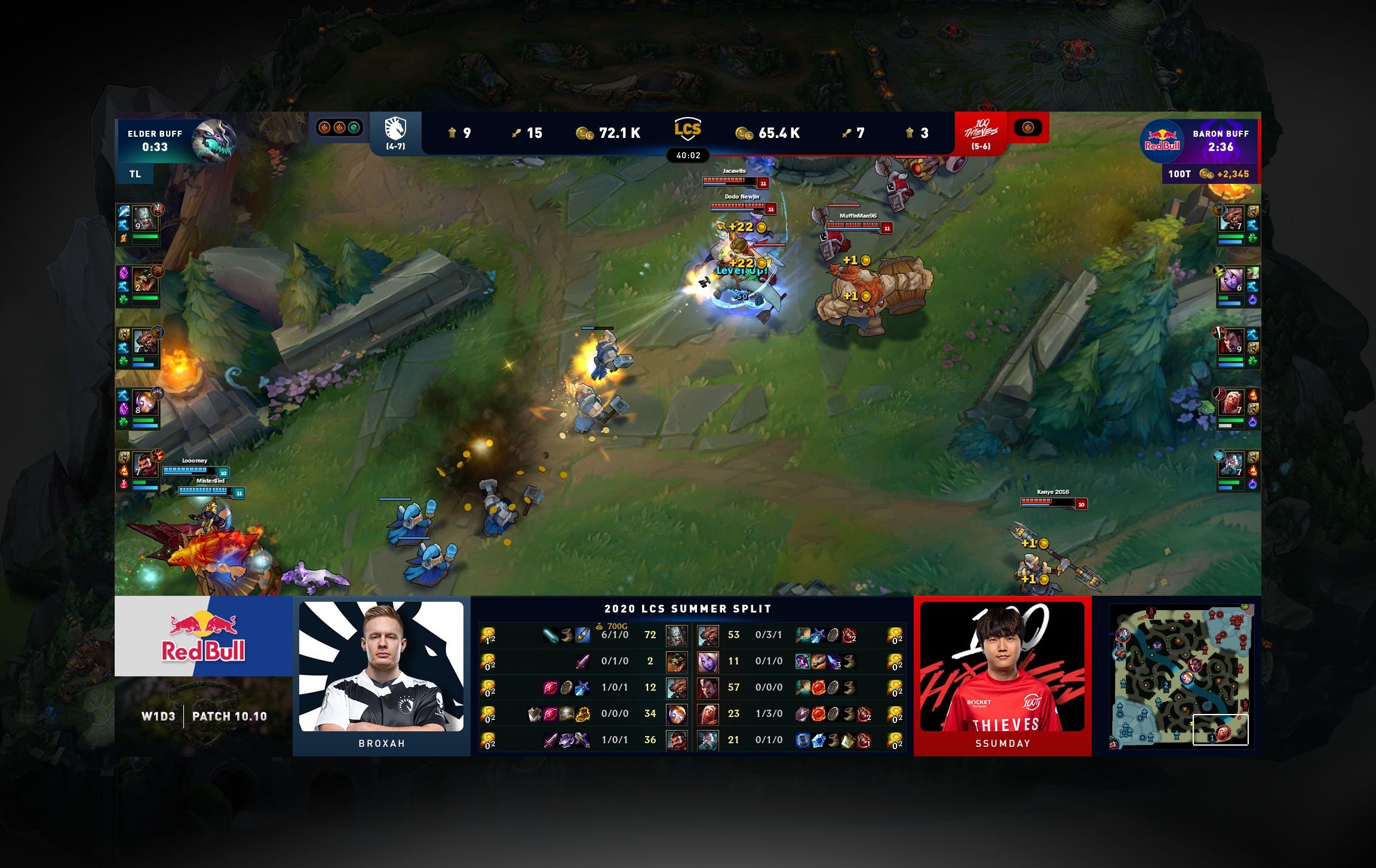
And lastly, the new HUD has a revamped design system - including colors, font style, icon usage, and team branding - to be more consistent and to provide more clarity for viewers.
SAY HELLO TO YOUR NEW HUD
=========================
While we believe these upgrades are a step in the right direction for the LCS and Academy, we’re always looking for ways to improve the broadcast and plan to continue delivering a top-notch product. The strike team will keep listening to your feedback, and plans to make incremental improvements to the HUD as the split moves along. While your feedback might not make the cut for Week 1, we’re listening to it.
The new HUD will debut in Academy on Thursday, June 11 at 3:00 PM PT and in the LCS, starting with Friday Night League on June 12 at 5:00 PM PT.

